© Pete Klassen, 2002. All Rights Reserved.
For ideas, questions or contact: thehutt@gmx.net

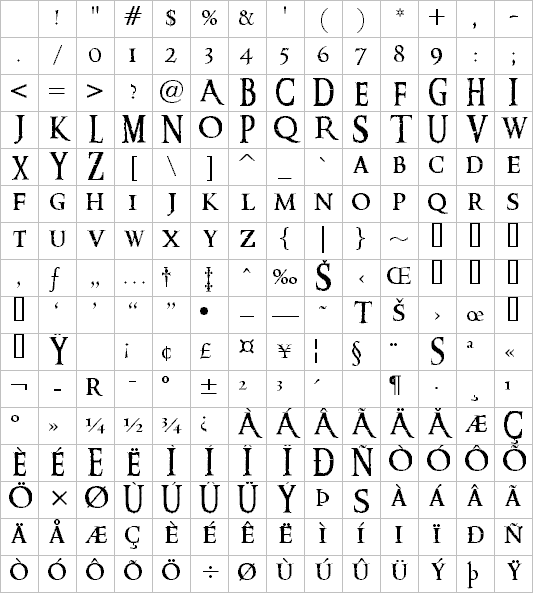
| Letter | Character | ASCII Code | Comment |
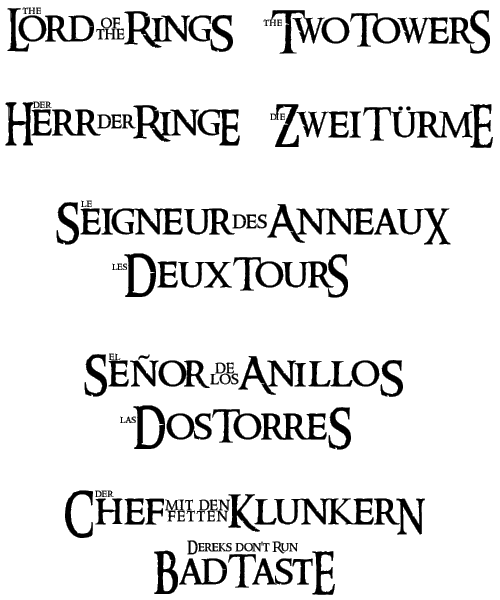
| A | A | Middle-size A as used in French Anneaux | |
| E | E | Hanging E; as in German RingE | |
| E | Ę | Alt + 0202 | Big E, as in German TürmE |
| F | F | Hanging F, as similar to E | |
| i | i | Low-case I with reduced height, as in Rings | |
| i | î | Low-case I with normal height, as in Zwei | |
| K | K | Not on any logo; same premise as A and R | |
| O | O | Middle-size O | |
| Q | Q | Middle-size Q | |
| R | R | Middle-size R, as in Rings | |
| r | r | Lower-case R, as in Lord | |
| r | ® | Alt + 169 | Lower-case R with prolonged tail, as in Herr |
| S | S | Large capital S as in Seigneur | |
| S | ß | Alt + 0223 | Hanging S as in RingS |
| S | © | Alt + 0169 | Large modified S as in TowerS |
| T | T | Large capital T as in Two | |
| T | ™ | Alt + 0153 | Middle-size T as in Towers |
| W | W | Middle-size W |